Case Study
Absolute Software
Absolute Software is a global leader in cybersecurity, specializing in endpoint resilience and secure access for distributed workforces. With a rapidly evolving product ecosystem and a renewed focus on brand clarity, their goal was to modernize their visual identity, streamline content production, and better communicate their complex offerings through a people-centric, design-forward lens — ultimately supporting marketing, sales, and internal teams with scalable and flexible creative assets.
Brand System
Illustrations
Website

Where We Started
To help further their investment goals, Absolute had already initiated an update of their brand strategy and identity. They needed visual assets that better aligned with their updated messaging — smart, design-forward, and market-leading — and a design system that felt fresh and unified while still remaining flexible and scalable for their internal teams.
With the help and expertise of the project’s creative director, David Crompton, they’d made great progress in developing a general framework of what they wanted to achieve visually based on the new brand direction.
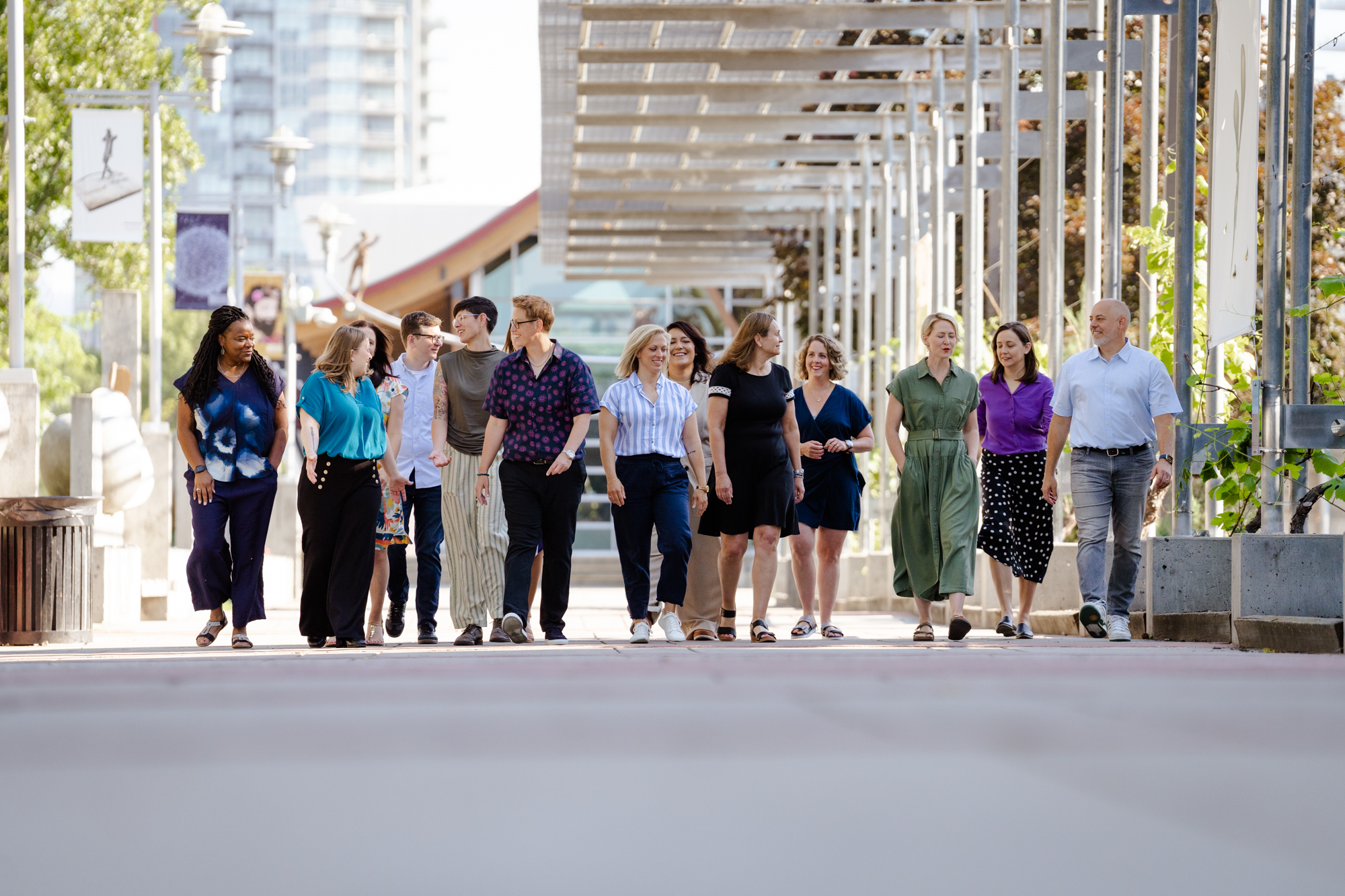
From the earliest stages, the goal was to move away from dated, corporate aesthetics and toward something more human, intuitive, and vibrant.
I was brought in to help define this framework and create a functional design system that Absolute’s team could run with. It was my job to create the foundational set of image, illustration, and diagram treatments — giving the brand a creative identity that could be consistently applied across many different channels.
Our solution included:
- Standardized image naming conventions and a structured folder system (across Adobe Creative Cloud and Dropbox)
- A shift away from product-centric visuals and toward people-focused photo collages and brand-specific vector illustrations
- Visual storytelling tools like diagrams, collages, and icon systems that felt unified but flexible
- Defined guidelines around asset design (no photos featuring end user roles, no repeated photos, more whitespace, more design intent)
Deliverables
Illustration & Digital Collage
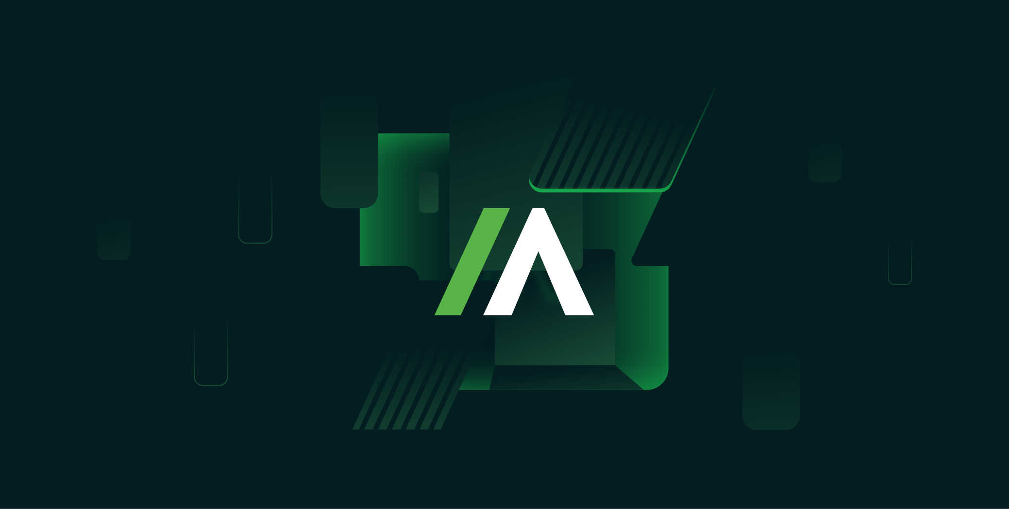
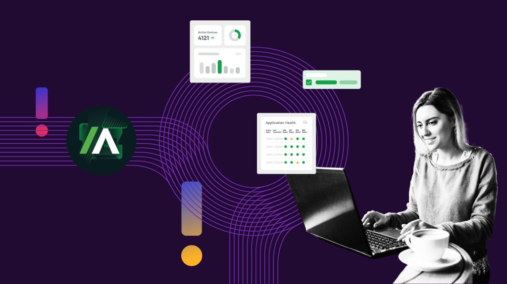
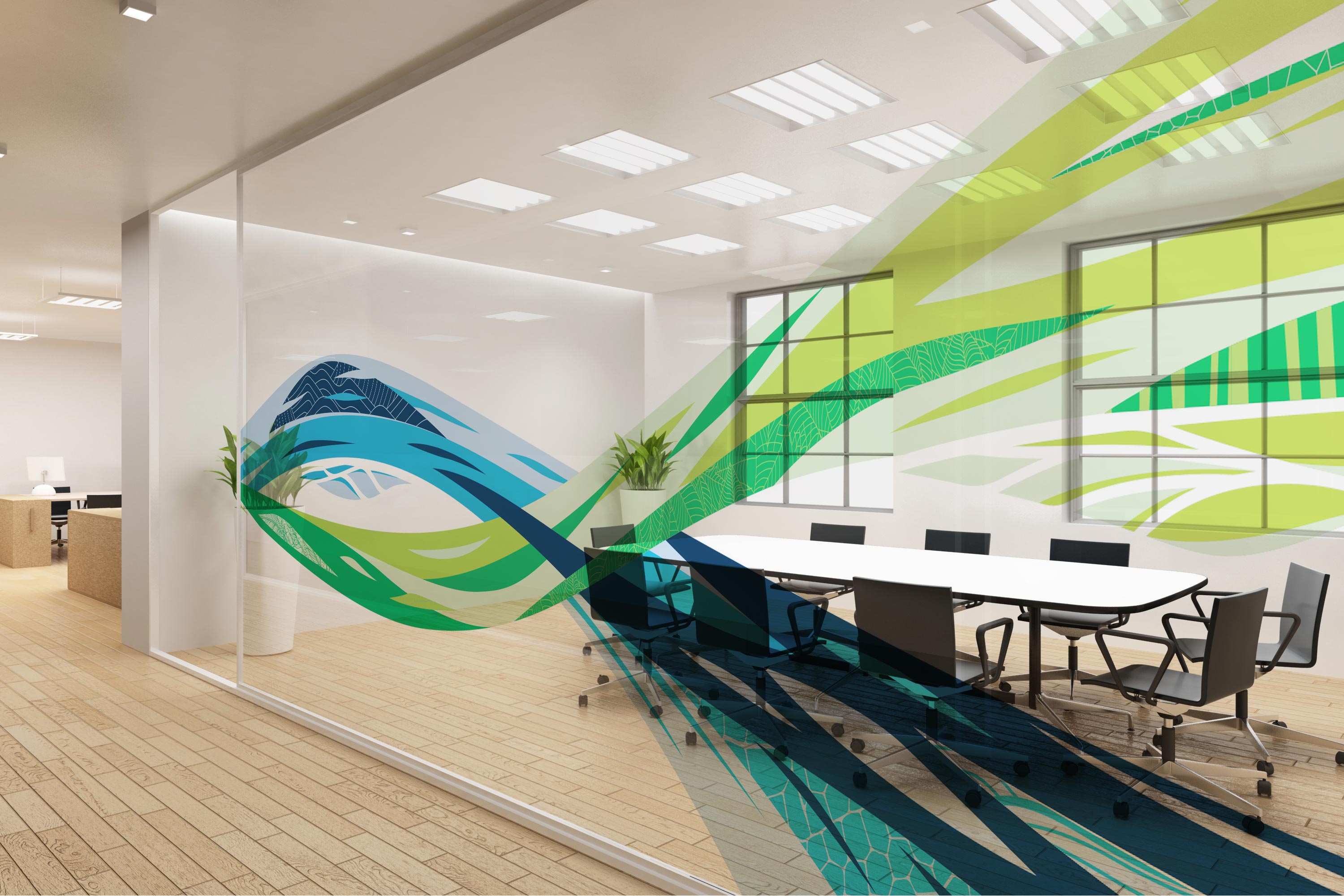
One of the most impactful elements of the new design system was the layered collage and illustration we introduced. I developed a blocky, minimalist, shape-based design language, with noise gradients and creatively-framed stock imagery to add depth and relate to different brand and product themes. The collage style became a flexible tool that was easy to adapt for web, internal decks, and campaign material, ensuring a consistent tone across all channels.

Image Treatments
I reworked the way photography functioned within the brand system. Instead of relying on generic stock imagery, I introduced image treatments — including framing devices, colour overlays, and duotone options — that brought visual interest and vibrancy to the image library. This empowered Absolute’s internal team to grab any photo, apply the new step-by-step treatment, and end up with something polished, on-brand, and customized for the product or technology they were featuring.

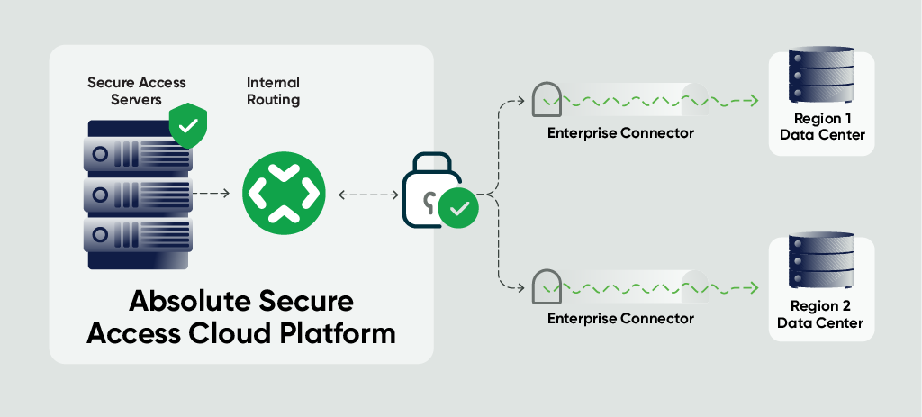
Diagrams
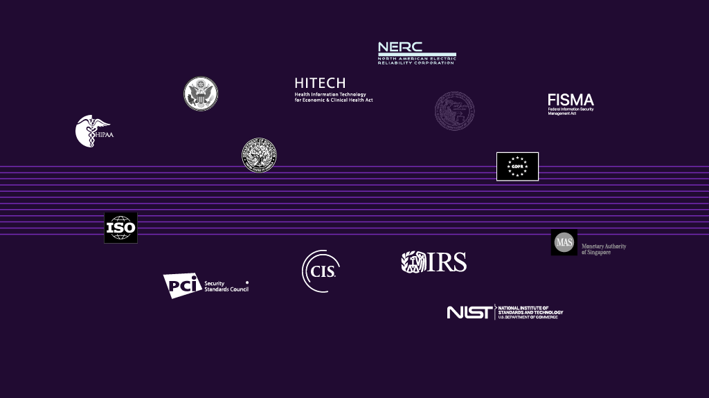
Absolute often needed to explain complex product, technology and network concepts. I helped design the language for their technical diagrams, defining how various technologies should be represented and what common designelements should be included for consistency across assets.
Presentation & Web Background Designs
I designed branded presentation templates that were created with hierarchy, pacing, and storytelling in mind, to give presenters a canvas for narrative-driven decks without relying on default layouts. With the new templates in place, even quick-turn internal updates could look executive-ready.
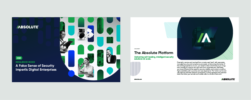
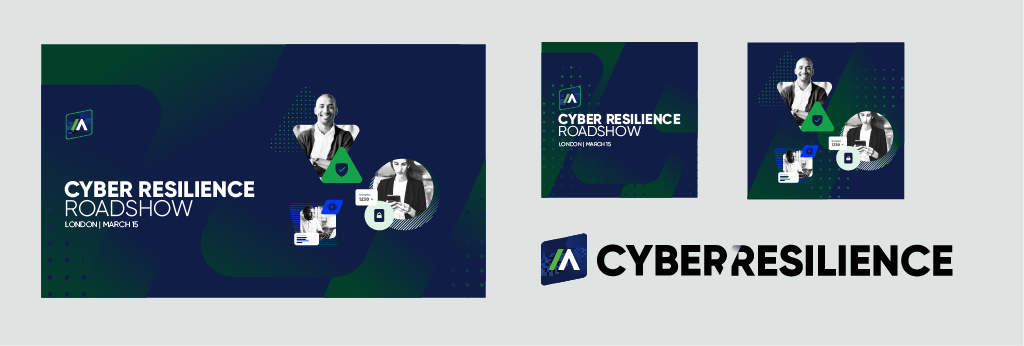
Marketing Campaign Materials
To help launch and introduce the new brand, I was tasked with creating complete visual design themes for advertising banners, social post templates and data sheets. I also contributed to new storyboarding strategies and motion-graphics support for their video team.
Training & Support
Once the new design system was approved and finalized, all of the elements were populated into Figma and stacked by resource type — with lots of team assistance and collaboration on construction and review — forming a huge library of page-by-page visual references.
A team of junior designers was tasked with assessing the content of each datasheet that required a redesign, then testing the new treatments and guidelines on new collages, diagrams, and illustrations to support specific products and technologies.
Watching 80-100 datasheets come to life, featuring newly-built assets and empowered by clear design guidelines, was pretty wild! The design team was up and running in no time, creating materials that matched the new brand style without needing constant support. It was a great example of design system training in action — not just looking good on paper, but actually being used successfully.
What made this project especially rewarding was seeing how quickly the internal team was able to take the reins after they were trained on the new elements and treatments.
Video ad storyboard concepts


Outcome
Through this project, Absolute achieved more than an aesthetic update — they sparked a change in how the brand communicated their value, innovation, and leadership.
With visual language that reflected their modern, people-focused identity, the new design system helped bring together teams, speed up design production, optimize team training and empower everyone — from creative to sales — to confidently represent the new brand.
Start with a discovery call.
