Case Study
The Fresh Perspective Group
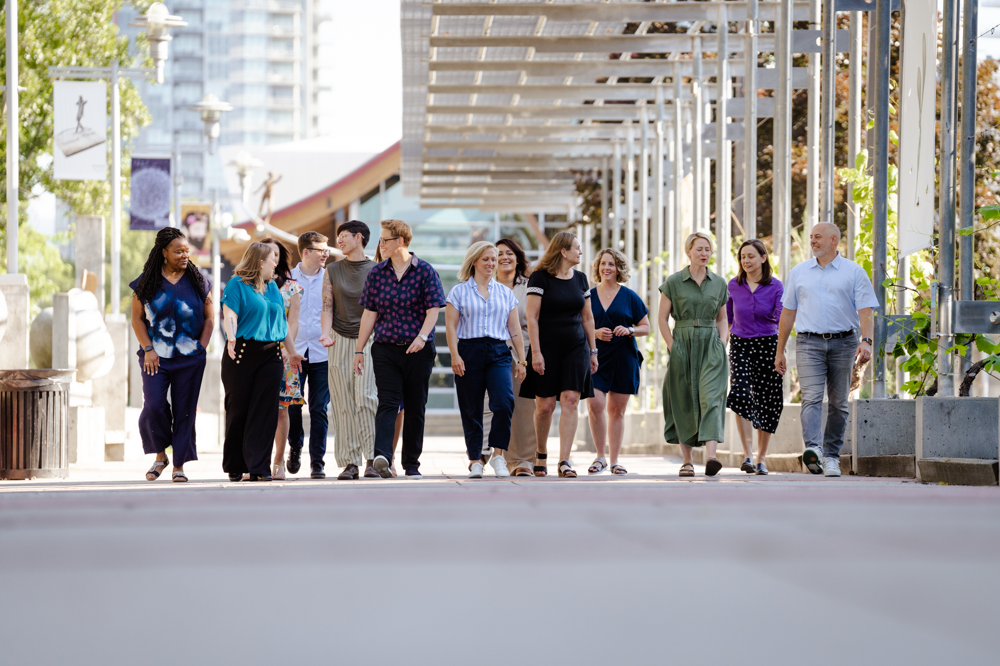
The Fresh Perspective Group (TFPG) proudly describes themselves as a passionate team of experts dedicated to empowering nonprofits and charitable organizations, by tackling challenges with creativity, integrity, and a people-first mindset. From a foundation of strong, growth-oriented values, TFPG’s unique strategic approach stands out and demonstrates a departure from traditional corporate norms — and the need for a departure from standard corporate design.
Brand System
Illustrations
Website
Where We Started
Jen Cole, TFPG’s CEO, wanted to ditch the dusty templates and jargon of typical nonprofit marketing spaces and bring fresh energy to a market that can often feel slow-moving and overly complex. Our creative brief focused on building brand elements that could reflect TFPG’s core promise — solving real tech problems for nonprofits — without losing sight of the people doing the work.
From the very start, Jen and Heather Ballachey, the project’s marketing advisor, developed a true sense of clarity about the kind of company they wanted to build.
The creative direction for this project started with a simple request:
“This needs to feel like nothing we’ve seen before.”
This project wasn’t just about creating a brand — it was about setting the tone for how the entire company was going to show up in the world. TFPG was in start-up mode, energized to do things completely differently from anything their founding team had been part of before. Their goal was to launch with a look and feel that stood out in the nonprofit consulting space — a brand that could hold its own among bigger consulting players but still feel grounded and warm. Something that felt like more than “just another Salesforce partner.” No fluff, no jargon, just good design that doesn’t try too hard and lets the company’s values shine through.
Our mission was clear: build a brand identity that actually felt fresh, while remaining concise, smart, and human.
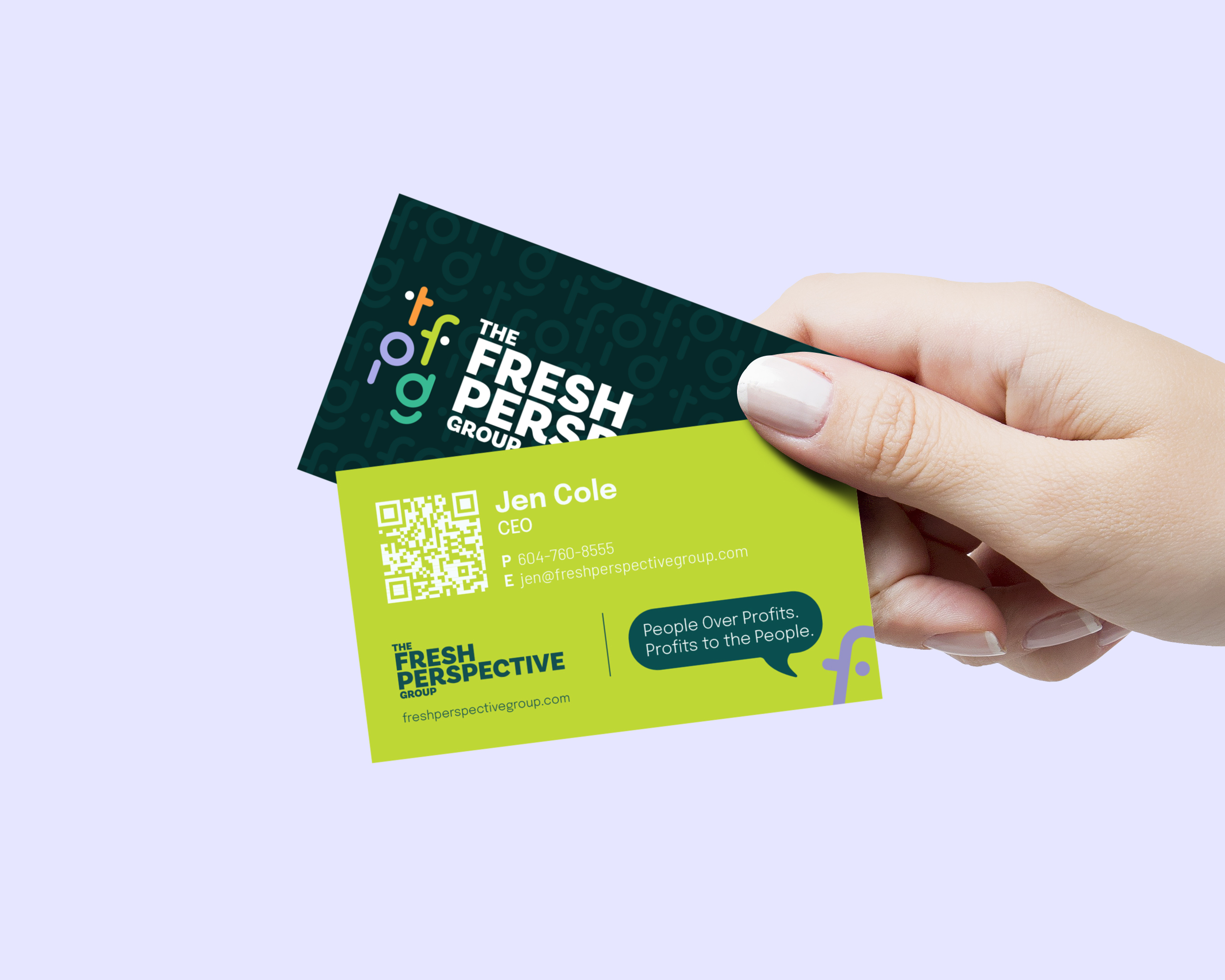
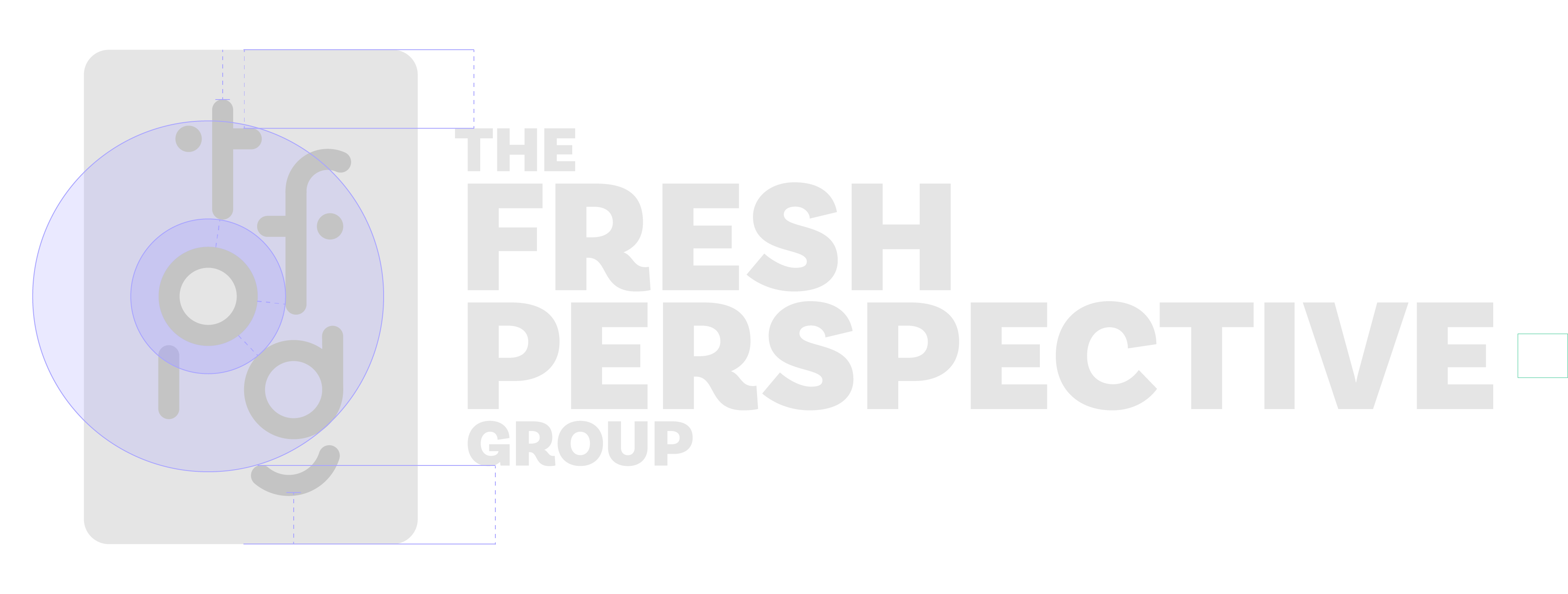
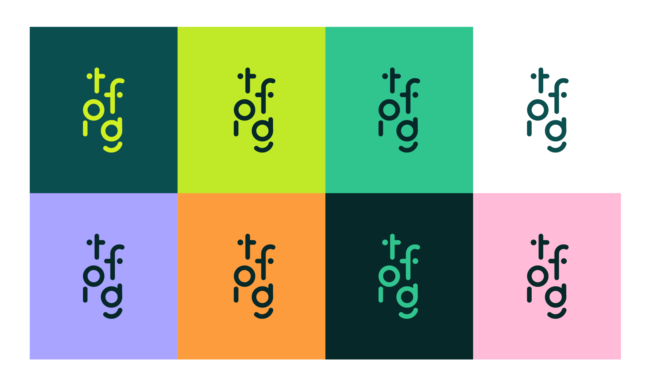
The Logo
In order to align with TFPG’s sense of authenticity and irreverence, I wanted to create a logo that was versatile and fun, but not childish. Developing both a full wordmark as well as a monogram design helped the brand stay compact and recognizable across all platforms — wordmark for official corporate materials and key opportunities to introduce the brand, monogram for smaller and simpler design assets.
Logos that are “fun and simple” need extra balance and accuracy to ground them. Everything about the TFPG logo and monogram is founded on a clean system of spacing and alignment, so that it maintains a strong sense of professionalism and readability no matter where it’s used.
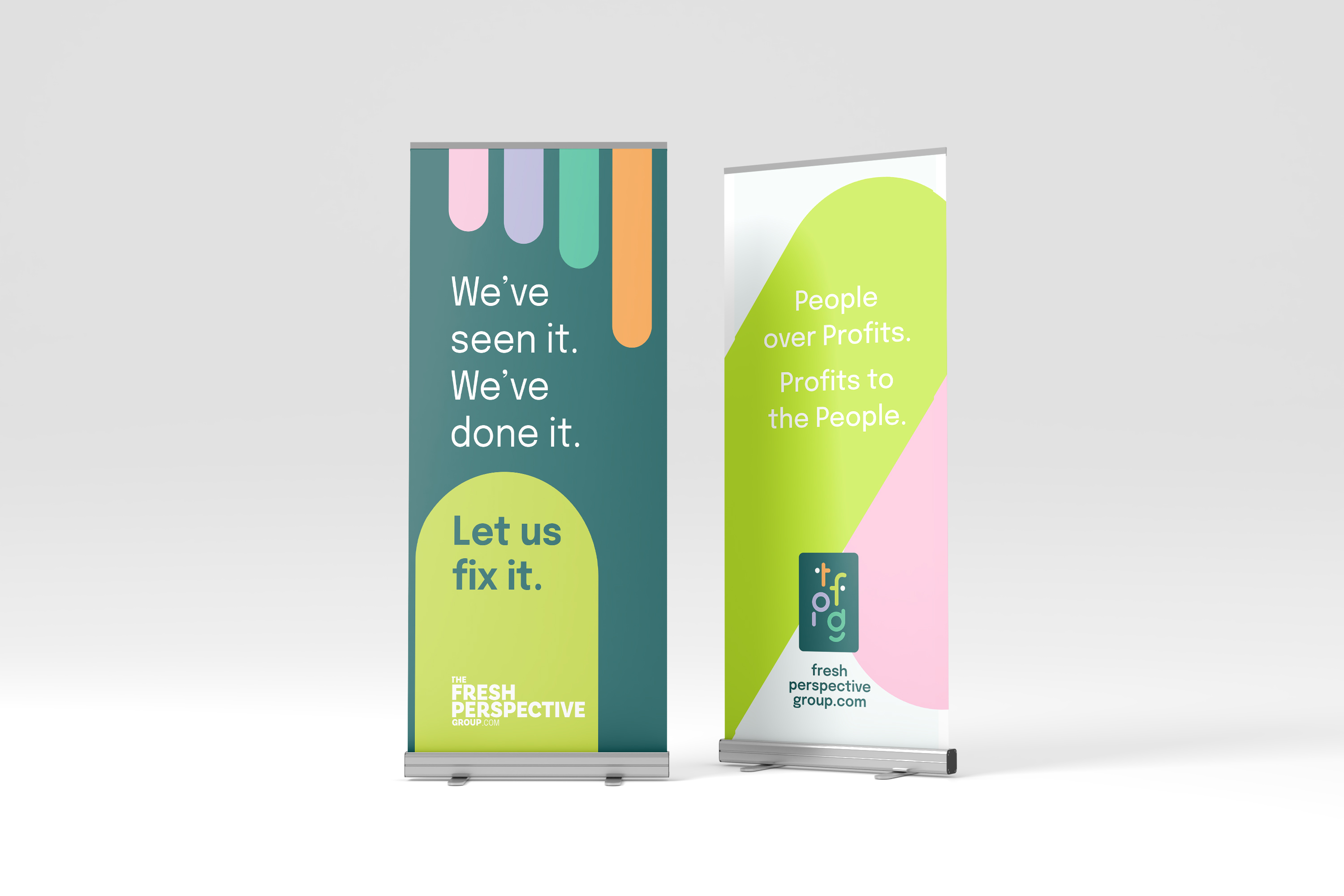
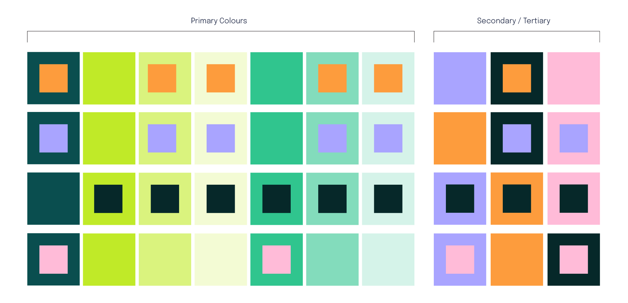
Colour
We went in with contrast in mind — balancing punchy, optimistic colours with more grounded tones. The Bright Green became a bit of a hero, paired with Deep Teal to anchor everything. The secondary and tertiary colours gave us flexibility for iconography, web stuff, and merch — without losing cohesion. Everything was tested in real use cases to make sure the palette held up across digital, print, swag, and signage.
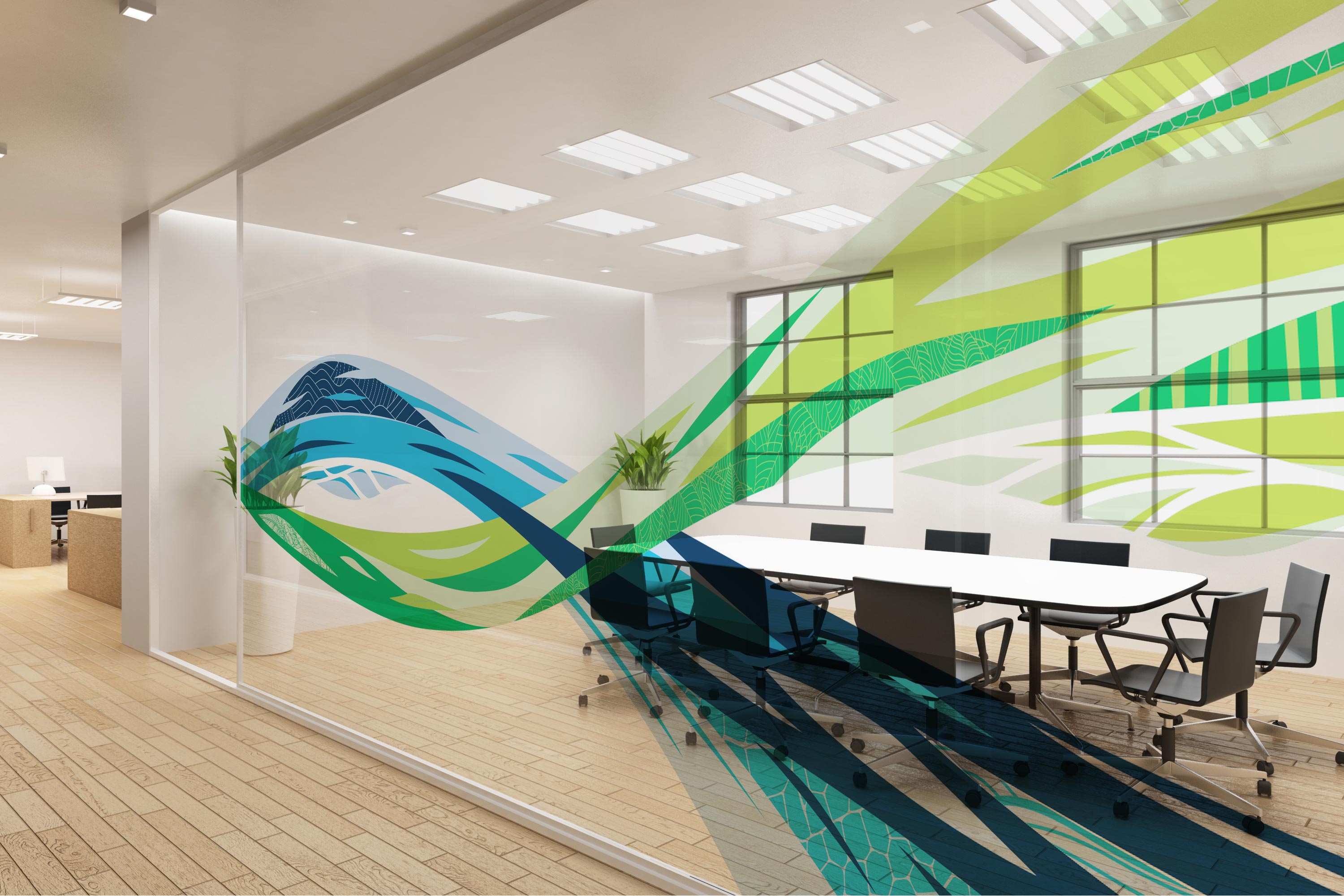
Illustration & Iconography
This was where the brand really came to life. I designed a complete system of modular illustrations and a growing library of icons — each tailored to the brand’s core themes: people, simplicity, gratitude, and potential. We kept things warm and human, with soft gradients, abstracted characters, and a layered, Art Deco-inspired visual style. The icons were structured into three tiers to match different levels of storytelling — from core values to UX cues.
Colour palette
Tier 2 icons and iIllustrations


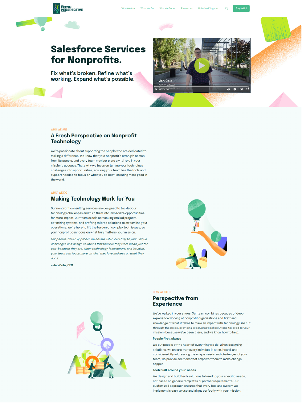
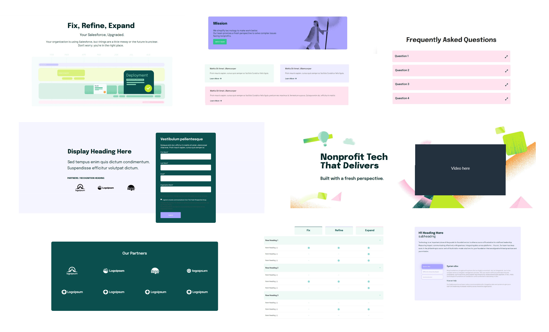
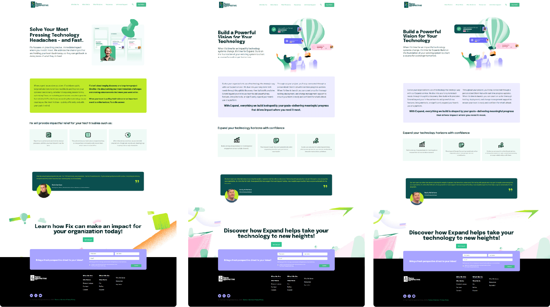
Website
The development process for the TFPG website was extremely collaborative and ran smoothly. I led design direction alongside three other web developers while Marthe Rana, TFPG’s Director of Marketing, and Heather led content and SEO efforts.
We followed a hybrid workflow that began with onboarding and creating a site structure in Figma, followed by content and SEO preparation, then final wireframing and development using Hubspot website CMS (TFPG’s existing digital marketing platform).
The site was built using only a few basic theme elements to support the site’s navigation and some core sections. Working closely with the corporate and marketing teams, I extensively customized the rest of the site design, building out a tailored structure that aligned with the organization’s goals and supported their future growth.
We launched with 10 core pages and 18 pages with CMS-editable development, while also accommodating future marketing-built landing pages.
A comprehensive and well-planned workback schedule enabled project check-ins to be regular but casual, with standardized rounds of review that provided clarity and structure for the team. I supported the website project all the way through launch, including publishing, testing/troubleshooting, and delivering clear handoff documents, video demos and tutorials, and follow-up support post-launch.
To make it easier for TFPG’s marketing team to create new pages using the Hubspot platform, I created a drag-and-drop section library in Figma, with a range of pre-built design variations to help avoid too much repetition. At site launch, I provided TFPG with a PDF export of the Figma-based library and screen-recorded walkthroughs so they could build new pages confidently using their Hubspot account.
Unfortunately, the live TFPG website is no longer available to view online, but the visuals I've included below reflect the website design at launch.
Primary and secondary website pages
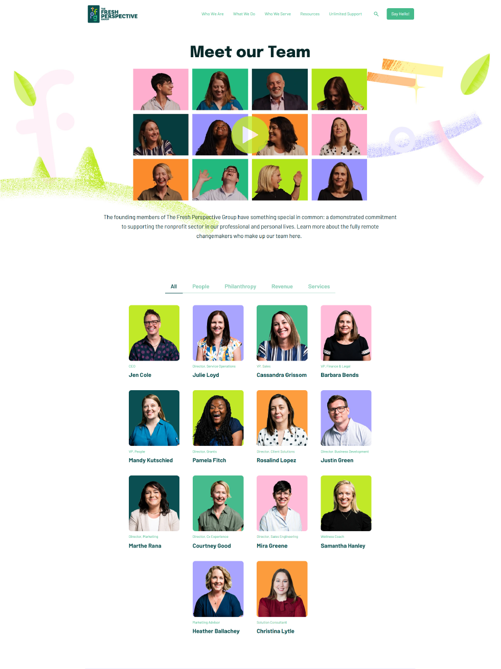
Tertiary website pages
Built to Scale
An essential part of delivering this brand system was empowering the TFPG team to run independently with all of the new design files and treatments after launch.
I created detailed support documents, recorded over 15 training videos, hosted two 1-hour training sessions with the marketing team, shared Hubspot webpage and email templates, and developed CMS-friendly web components — all designed to make it easy for non-designers to maintain brand accuracy across all TFPG’s marketing and communications touchpoints.
All iconography and illustrations were delivered in a layered, modular format — with all treatments and textures built in — to enable their visual elements to be simplified or re-combined to represent different company initiatives and narratives.
Outcome
Thanks to excellent collaboration and communication with Jen, Heather and the TFPG leadership team, the new brand launched successfully in May 2024, with a new website design following in August 2024.
Internally, TFPG’s team members expressed that they “felt like a real company now”. They could actually see themselves in their brand presence, with a beautiful set of visuals to help them tell their story and invite clients into their culture of gratitude and potential.

Start with a discovery call.
