CrossFit Pyro
Over the past seven years, I’ve helped CrossFit Pyro’s visionary owners grow their business from a single gym location into a into a trusted fitness brand and successful online coaching experience. With a spirit of invention, great collaboration, and consistent brand execution (from logos and website design to apparel and large-scale murals), what began in the owners’ garage grew into a thriving CrossFit community hub in northeast Calgary. And the gains haven’t stopped there.
Brand System
Illustrations
Website




Where We Started
CrossFit Pyro began like many bold ventures do...in a garage. Owners David Rochon and Emilie Dion had the incredible vision, passion, and community-focused drive to create a great experience for fitness enthusiasts, but they needed a stronger, more professional brand identity to match their ambitions.
When they purchased their first dedicated gym space in northeast Calgary, Alberta, the timing was perfect to create a visual brand that could carry them forward.
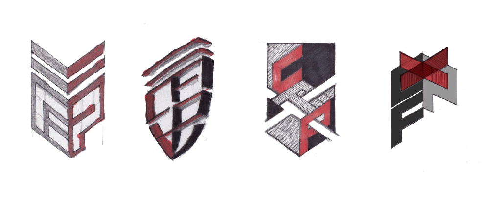
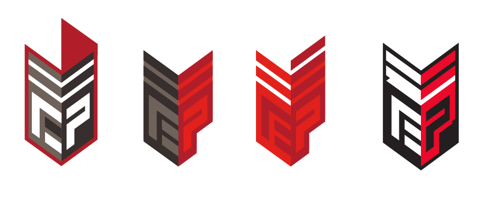
David’s background as a firefighter played a central role in shaping the company’s identity. Chevron and shield motifs (symbols of strength, and rank) became the backbone of the primary CrossFit Pyro logo. With the help of Emilie’s design eye and their shared sense of loyalty and teamwork, the CrossFit Pyro brand was built to reflect not just fitness, but resilience, discipline, and community.
The rebrand gave CrossFit Pyro the foundation they needed to grow from a local startup to a recognized CrossFit affiliate. It created a look and feel that resonated with members while staying true to their mission: empowering individuals, building relationships, and igniting inner potential through fitness.

Primary & Secondary Logos
The CrossFit Pyro identity was built around two core marks:
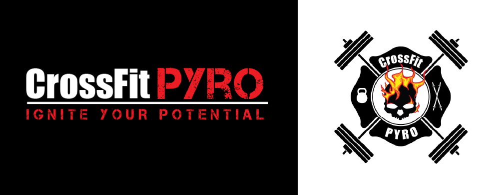
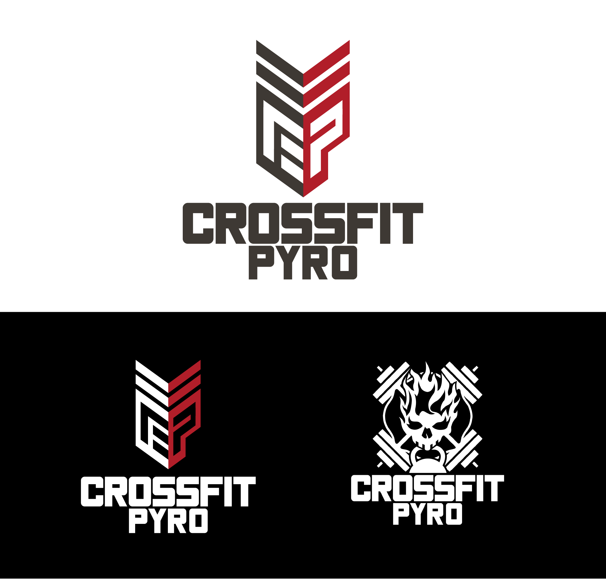
Primary Logo: A bold chevron-and-letterform mark, designed with sharp edges and a militarized style to reflect discipline, tradition, and progression. This logo became the backbone of the brand and was used across online platforms, signage, apparel, and program materials.
Secondary Logo: A reimagined version of CrossFit Pyro’s original “flaming skull” emblem. Drawing from both David’s firefighting background and the raw intensity of CrossFit, it blends firefighting symbols with CrossFit iconography like barbells and kettlebells. Updated for symmetry and simplicity, this mark served as a striking graphic element for merchandise, program charts, and special events.
Brand Expansion
Annual Pyromania Fitness Competition
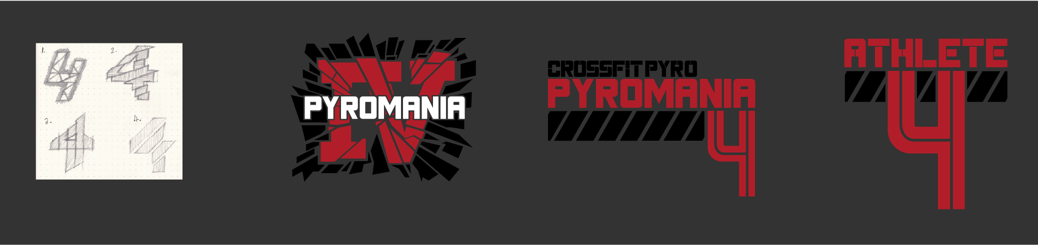
Pyromania became CrossFit Pyro’s signature annual competition — an “outside the box” festival designed to test members beyond their usual gym programming. I developed a full suite of logos and event branding for each year’s Pyromania event, creating a visual tradition that members could instantly connect with. Each logo tied back to the core CrossFit Pyro identity while lending every event its own distinct energy.
Pyromania competition event logos


Tiered Progression and Competitions
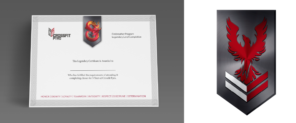
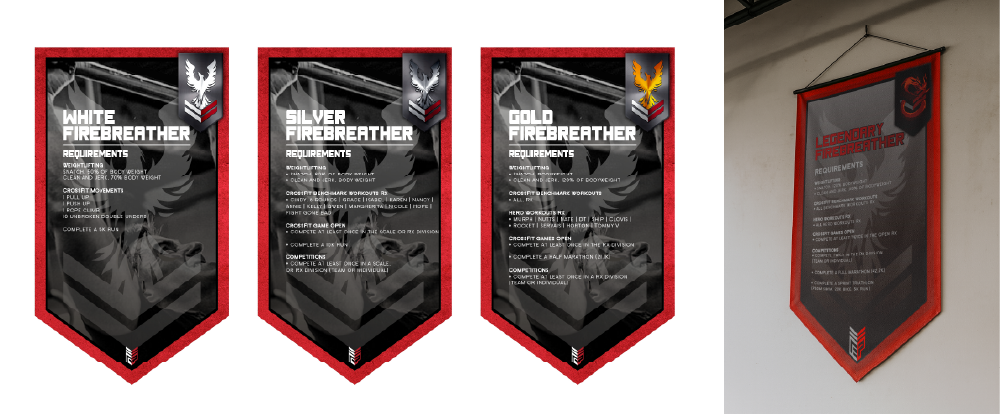
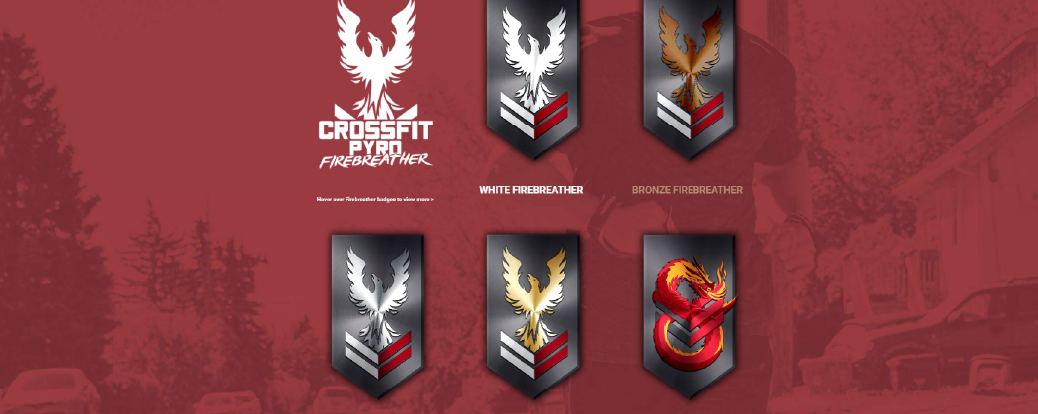
One of David’s most ambitious visions was the Firebreather program, a ranking system that rewards consistency and celebrates achievement, inspired by martial arts belt progressions.I translated this concept into a visual identity and mural system that gym goers saw every day, making the ranks both aspirational and tangible. Helping inspire clients to progress through white, bronze, silver, gold, and — ultimately — Legendary Firebreather levels, the Firebreather program designs reinforced the intention that ranks are “earned, not given.”
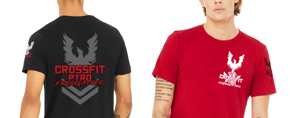
From competitions to apparel, the Pyro identity expanded into a recognizable system with consistency across all mediums.
Firebreather program designs



Digital Presence
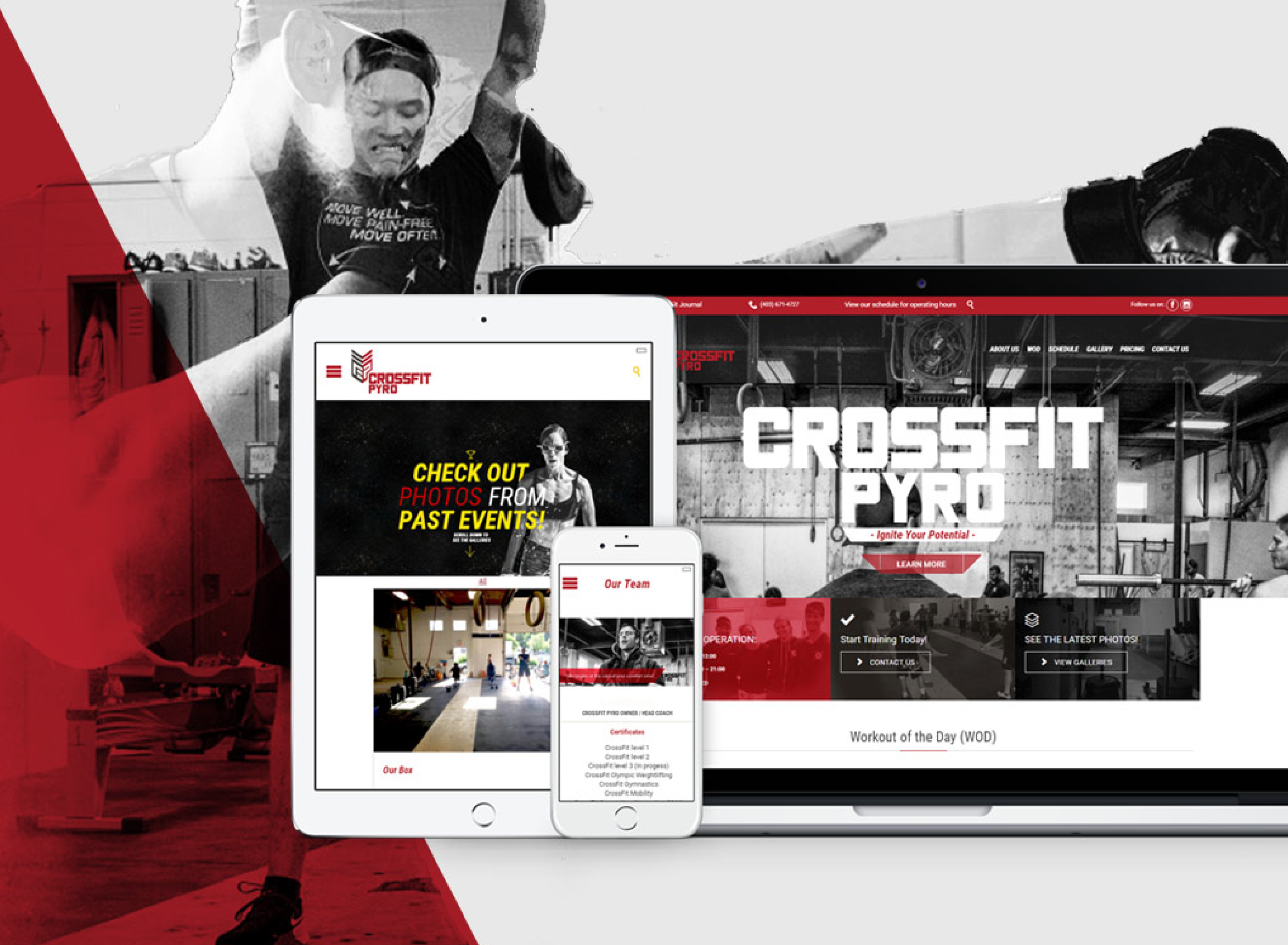
The CrossFit Pyro website was built on WordPress and became a key tool for the gym’s growth over nearly a decade. While the website design itself stayed consistent, the site evolved alongside the business, expanding to include new programming and pricing options, as well as seamless integration with the fitness scheduling app, RhinoFit for scheduling and membership management.
As the coaching staff grew, the site adapted with it, providing a dedicated space to highlight each coach and their expertise. Consistency in design meant that even as new sections were added, the experience stayed recognizable and easy to navigate for members. The end result was more of an online platform than a website. It didn’t require constant reinvention, but scaled steadily with the company’s growth while maintaining the same visual language that members associated with the CrossFit Pyro brand.
The Physical Space
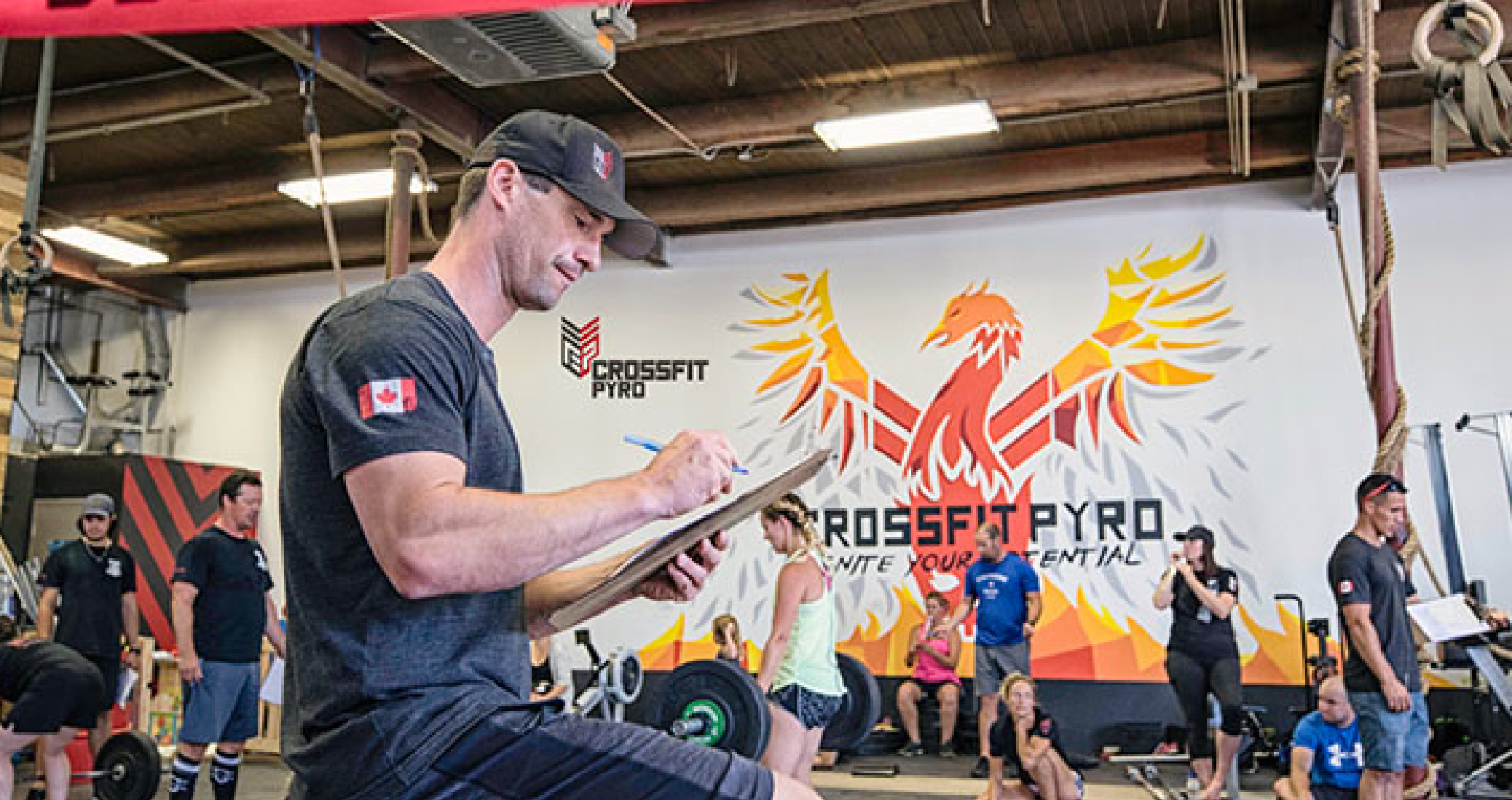
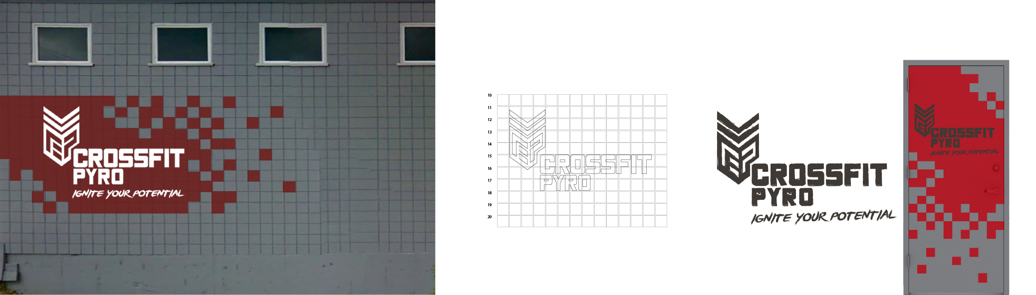
On the gym exterior, I developed a custom signage system, including a grid-based layout that could be hand-painted onto the grid-like bricks of the building. This brought the brand’s identity to the public and gave the gym an unmistakable presence in the northeast Calgary community. Together, the interior mural and exterior signage created a physical anchor for the CrossFit Pyro brand, created a daily reminder of the gym’s mission, and served as a visual marker of its status as a thriving community hub for fitness enthusiasts.
Indoor mural, outdoor sign mural and rear door signage
Outcome
CrossFit Pyro was never a one-and-done project, it is a brand that evolved in step with the business for nearly a decade. From the launch of their website in 2017 to the large-scale interior mural and exterior signage, the identity became a cornerstone of how CrossFit Pyro was seen in the community. Moving into a commercial space, the visuals gave the gym legitimacy and presence, positioning it as a serious CrossFit affiliate in Calgary.
The brand’s true strength has been its longevity. The foundation we set in 2016 with logos, colors, typography, and overall style has remained consistent and effective, requiring little change because the core audience and values were so well-defined from the start. That clarity allowed every new initiative, from competitions to apparel, to fit seamlessly into the system without diluting the brand.
As David and Emilie move on to new ventures, CrossFit Pyro stands as proof of how a clear, consistent identity can scale with a business, endure over time, and continue to deliver value long after its first launch.


Start with a discovery call.