Case Study
Deadly Invitations
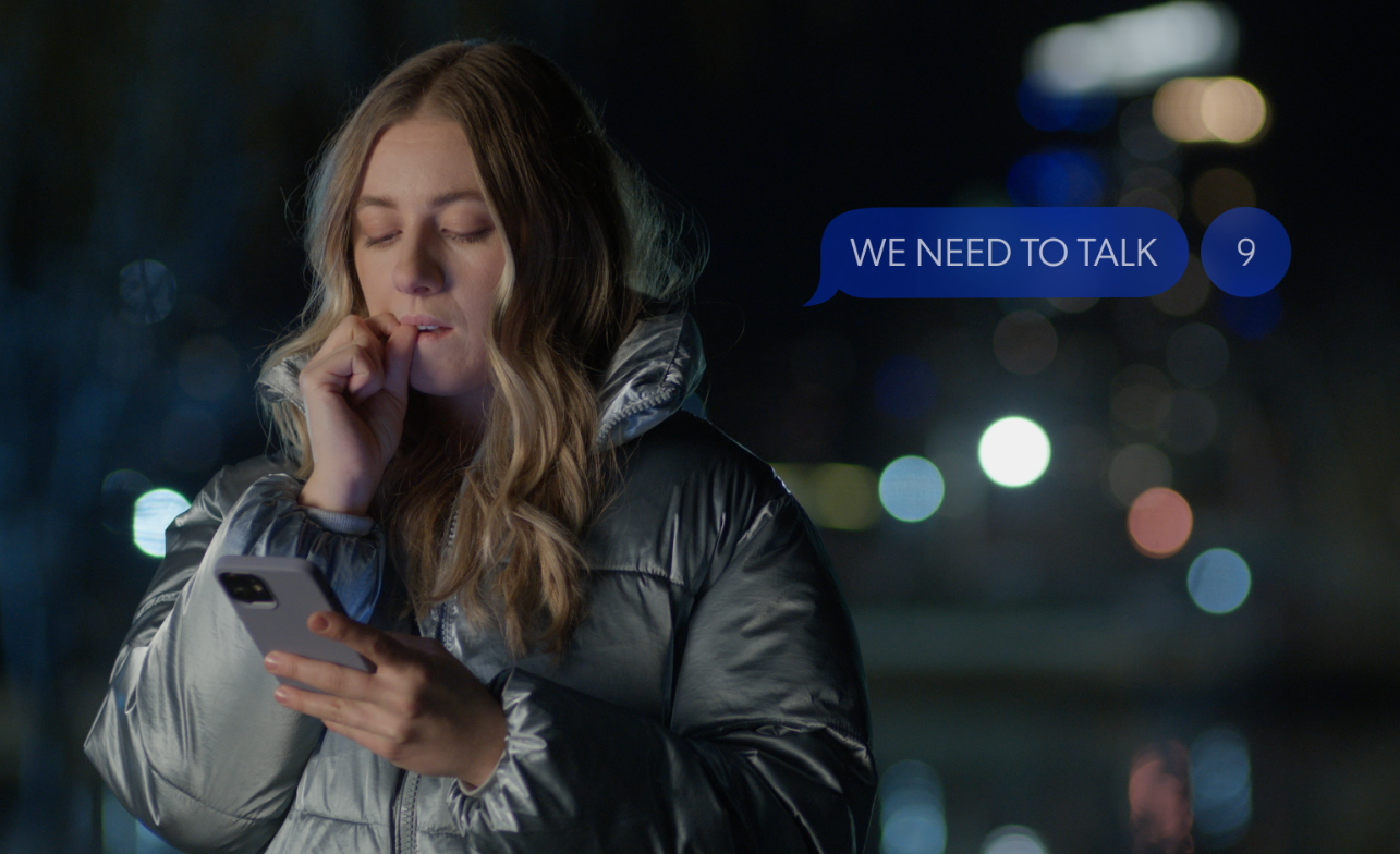
When you’re producing a thriller about an influencer diving into the dark side of the VIP crowd, the characters’ online activity and interactions play a major supporting role. For the Tubi Original film Deadly Invitations (2024, Monika Mitchell), I was hired to create visual identities, user interfaces, and dynamic on-screen graphics for fictional apps that are essential to the story.
Brand System
Illustrations
Website

The Challenge
Many internet-age thrillers rely on online interactions to help drive the plot forward, but production can’t necessarily use branded platforms like Snapchat or Instagram and often need the interface elements to be more clear and highlighted than normal UIs.
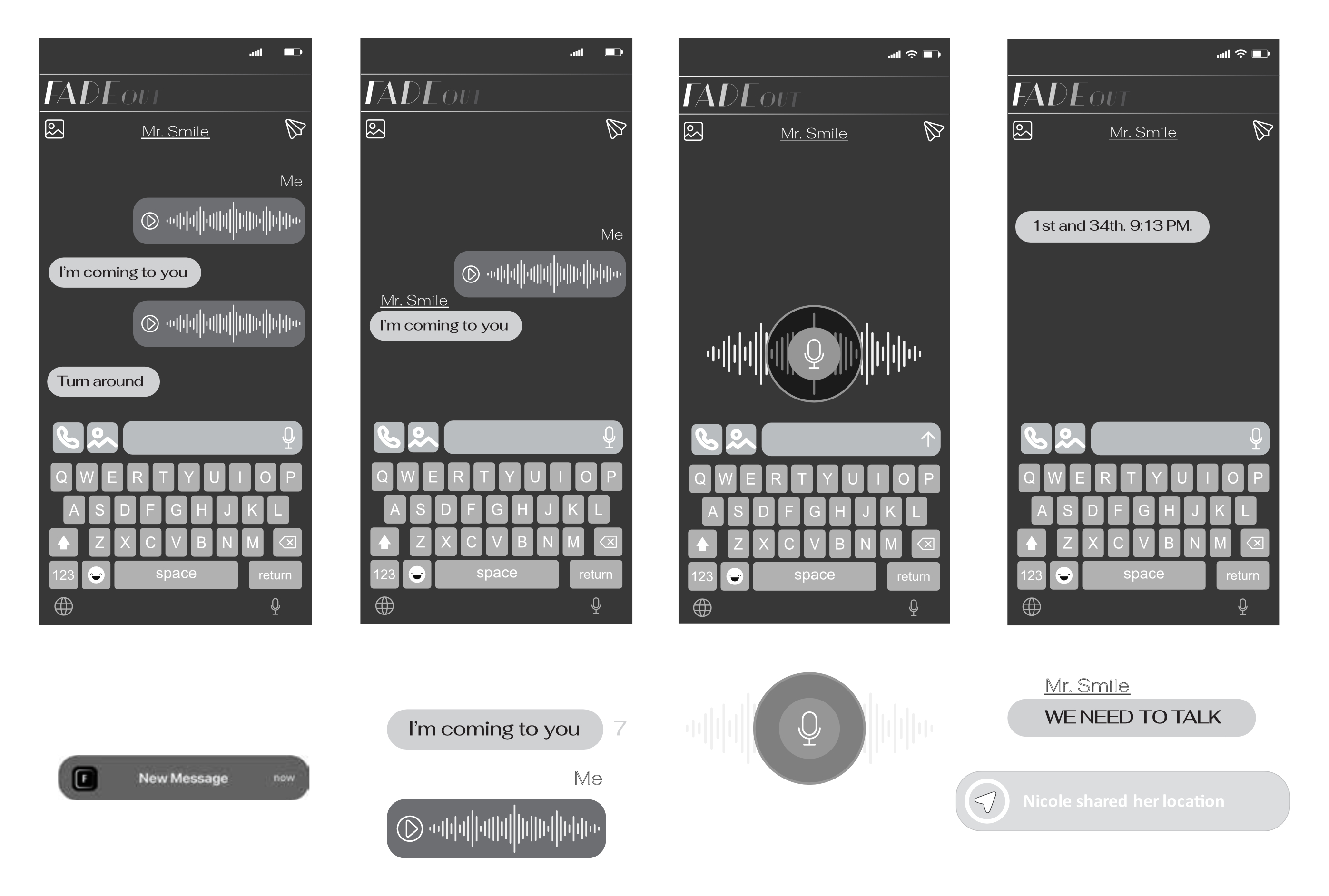
For Deadly Invitations, the art department provided basic wireframes and rough layout concepts for the digital apps and interfaces required by the script. My job was to use their initial concepts to build full-fledged visual identities for their fictional platforms, animate frame-by-frame digital interactions, and integrate the new graphics back into the raw camera plates.
Just as real-world branding requires building trust with customers, fictional branding in media needs to achieve instant believability with viewers. The process has a lot in common with traditional branding projects — developing color systems, interface or UI logic, and distinct visual identities — except that the 'target market' is dictated entirely by a film script. Each asset needed to align directly with the characters, tone, and dark thriller setting, enabling the technology to feel grounded in the story rather than distractingly “fake.”
Test Graphics Provided by Art Department
Custom App Ecosystems
To maintain authenticity in the film’s universe, fictional apps can't look like generic templates. I developed two distinct app visual systems for Deadly Invitations:
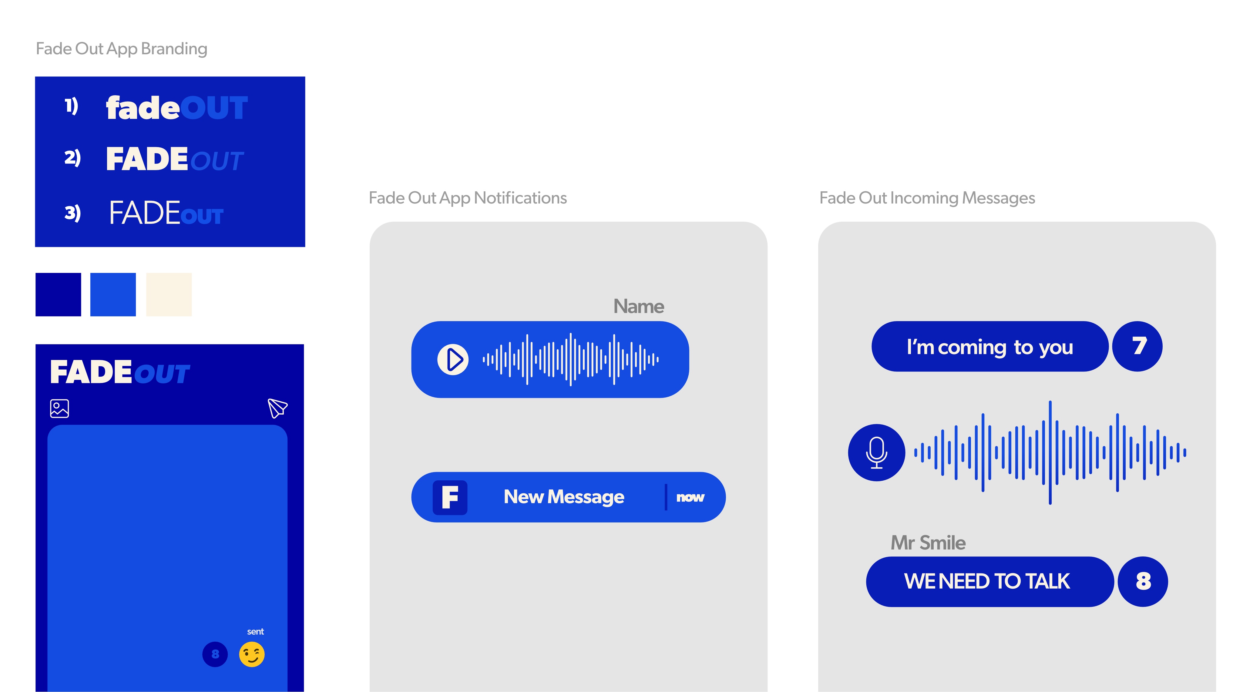
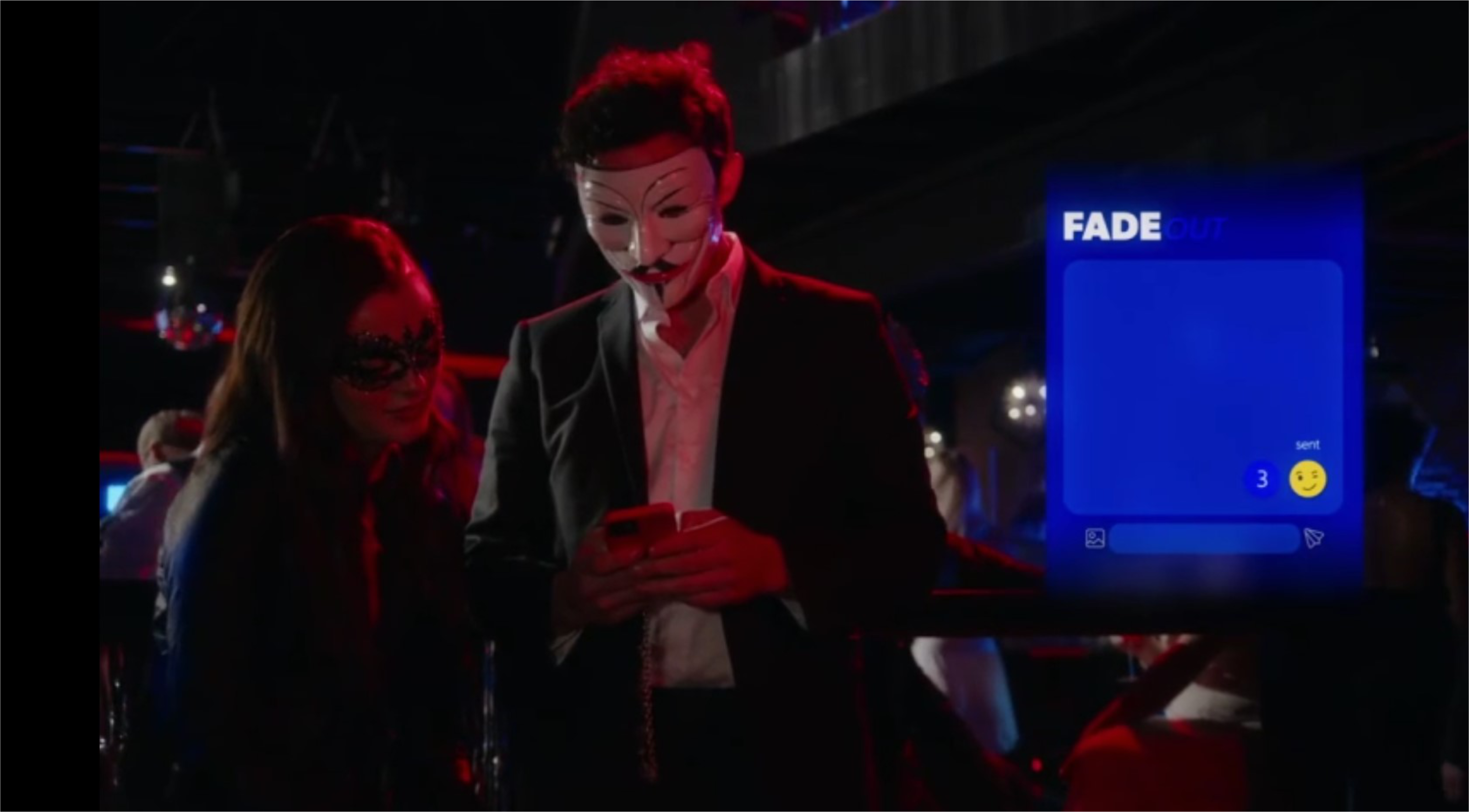
Fadeout (an encrypted messaging app)
Designed custom branding, icon systems, and layout mechanics to mirror modern “vanish after reading” messaging functionality and highlight plot-critical text.
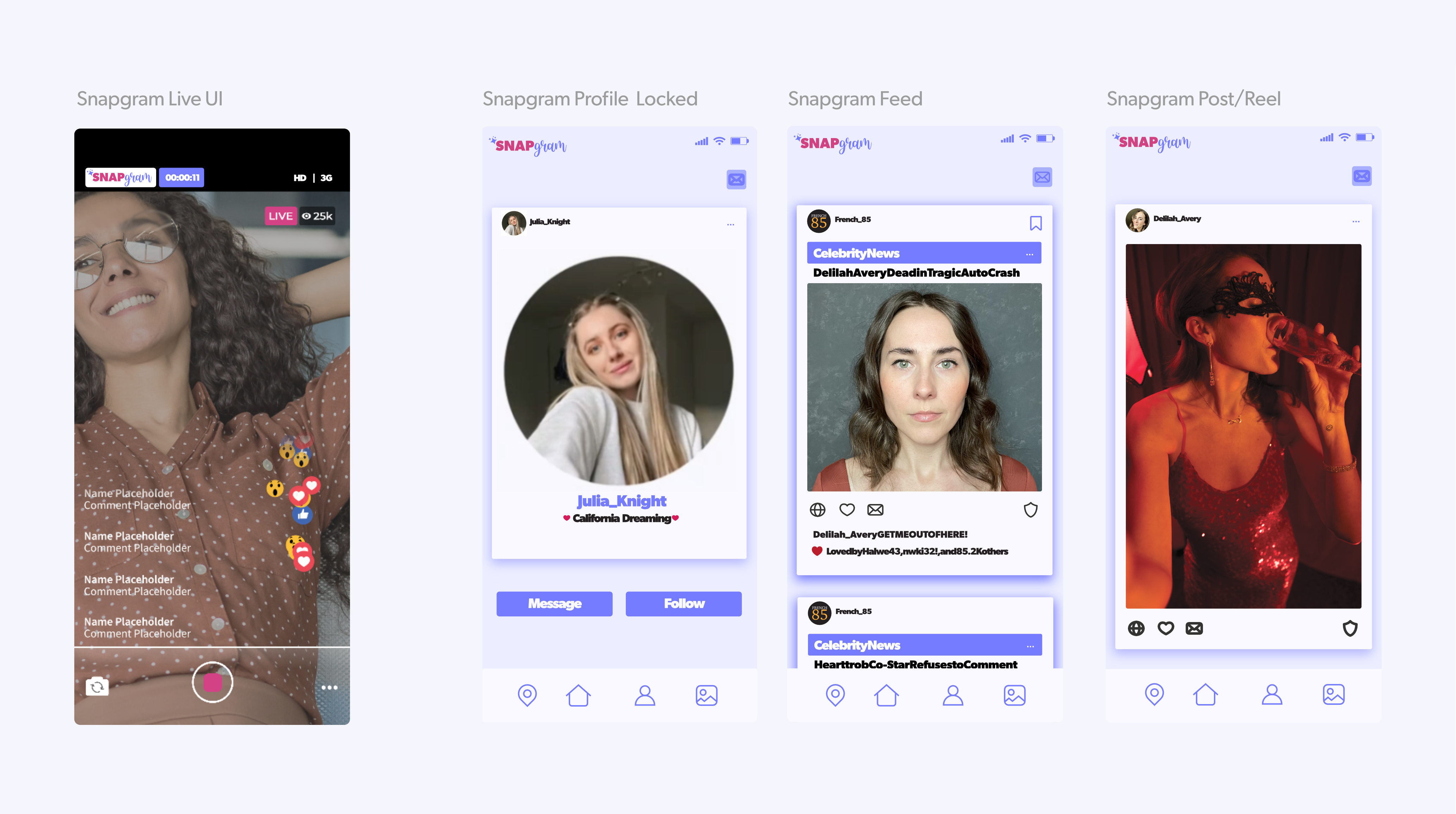
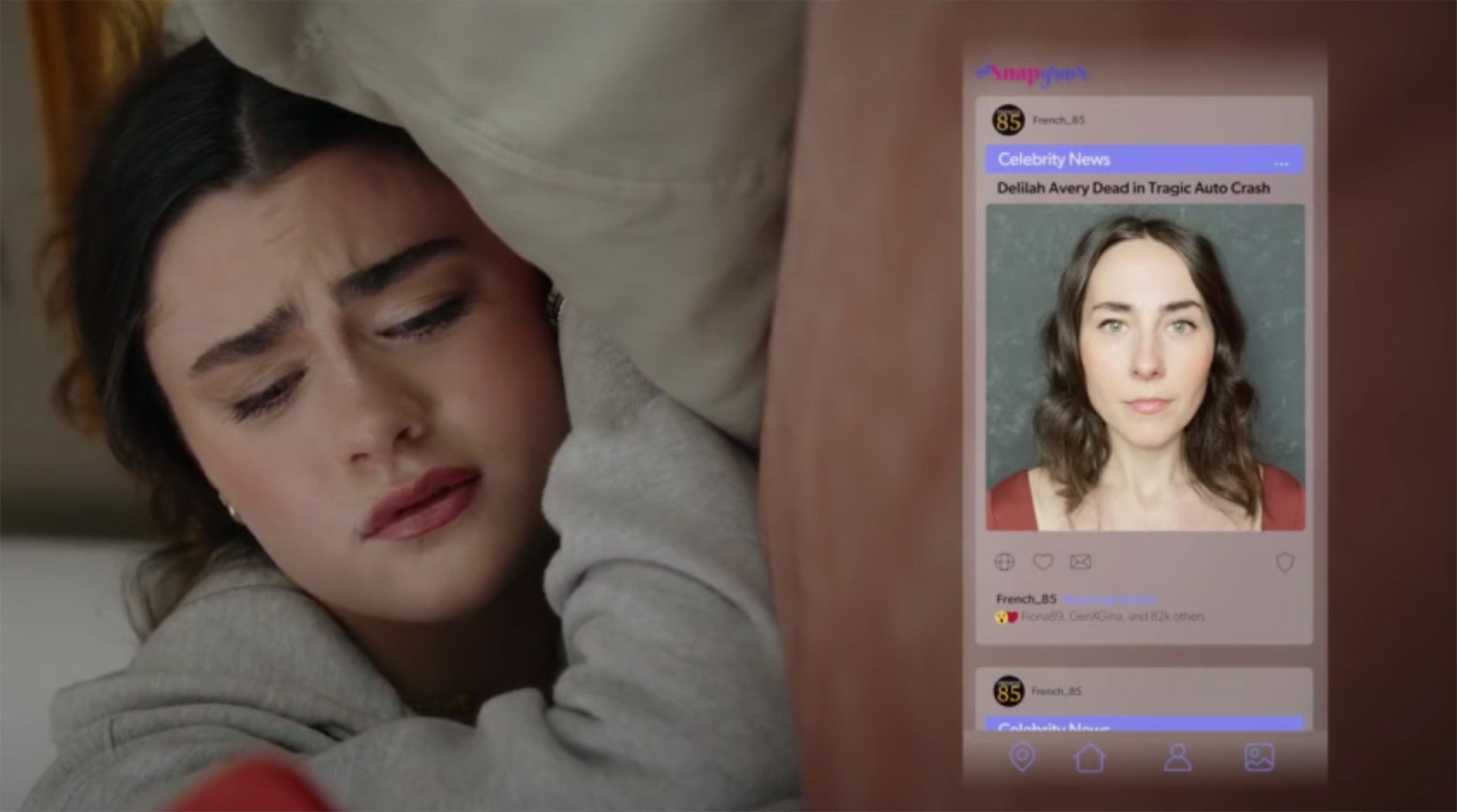
Snapgram (photo- and video-based social media app)
Created complete profile designs, user feeds, and interactive UI elements tailored to support specific camera framing and show the characters’ online discoveries.
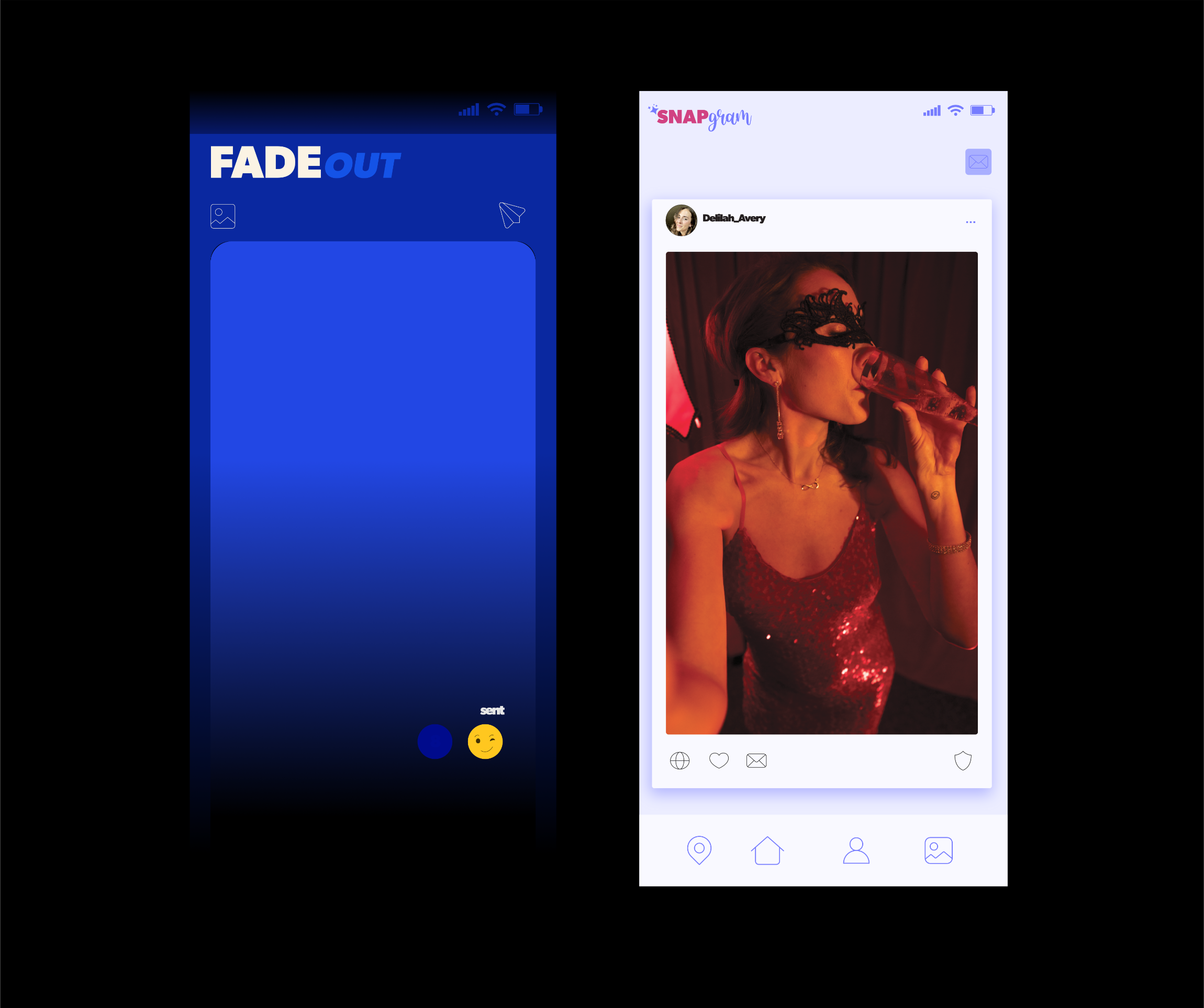
FadeOut App, Message, and Notification Design

Snapgram App, Message, and Notification Design
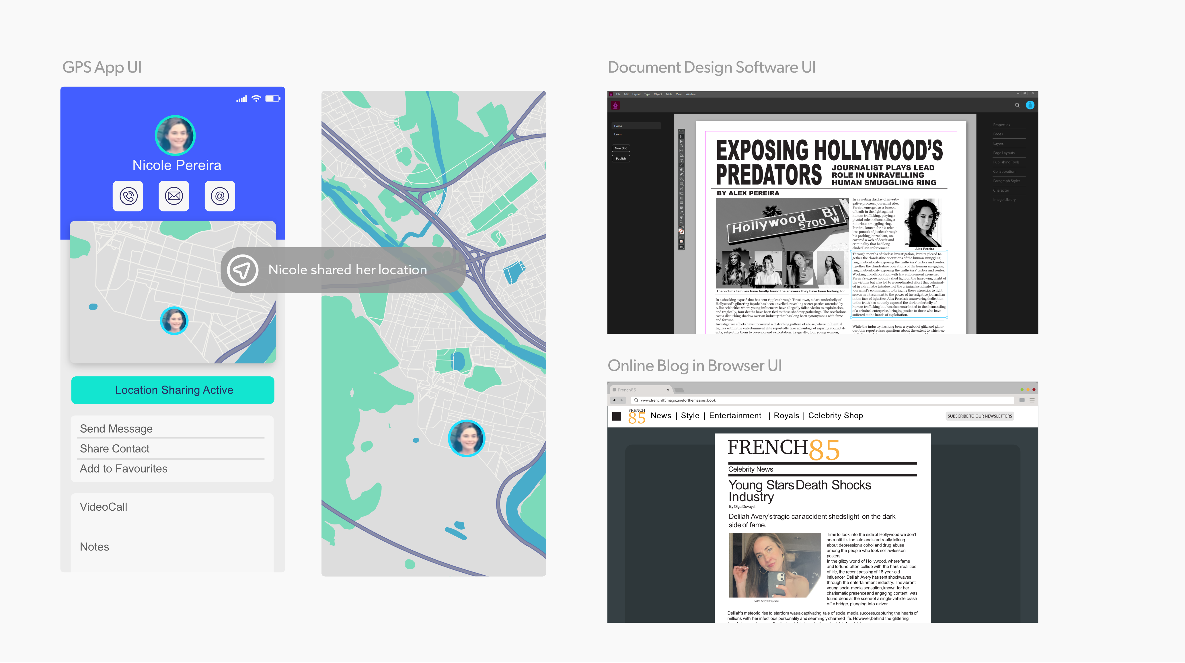
Plot-Driven Interface UI
Beyond social apps, the script required real-time interface graphics to track the story across multiple devices.
Interactive Maps
Dynamic GPS navigation interfaces showing route tracking across different screen aspect ratios.
Lockscreen Notifications
High-visibility banner alerts tuned for quick reading onscreen.
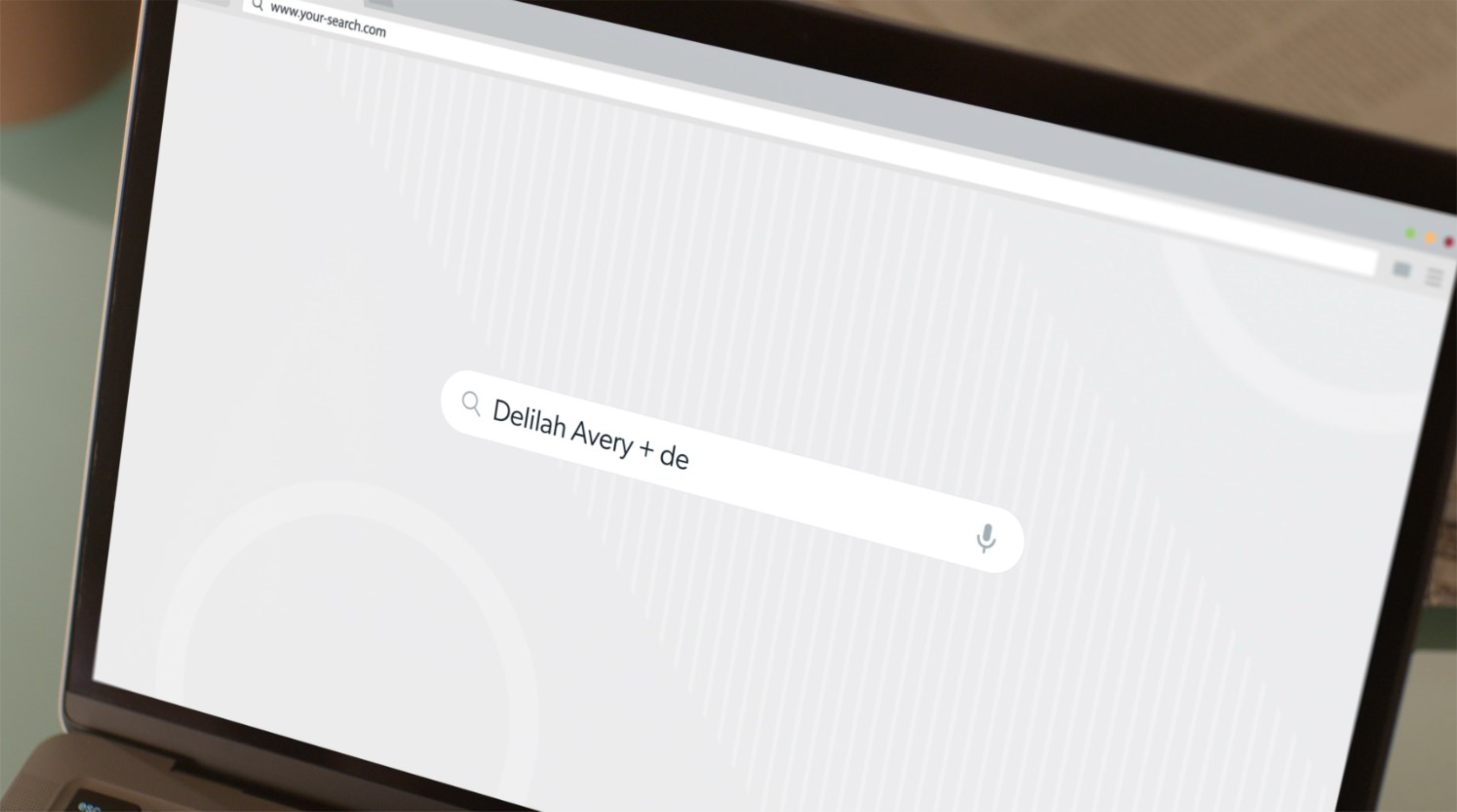
Desktop Browsing
Custom browser layouts and search interfaces.
Interactive Navigation App & Internet Browser Search Page Design
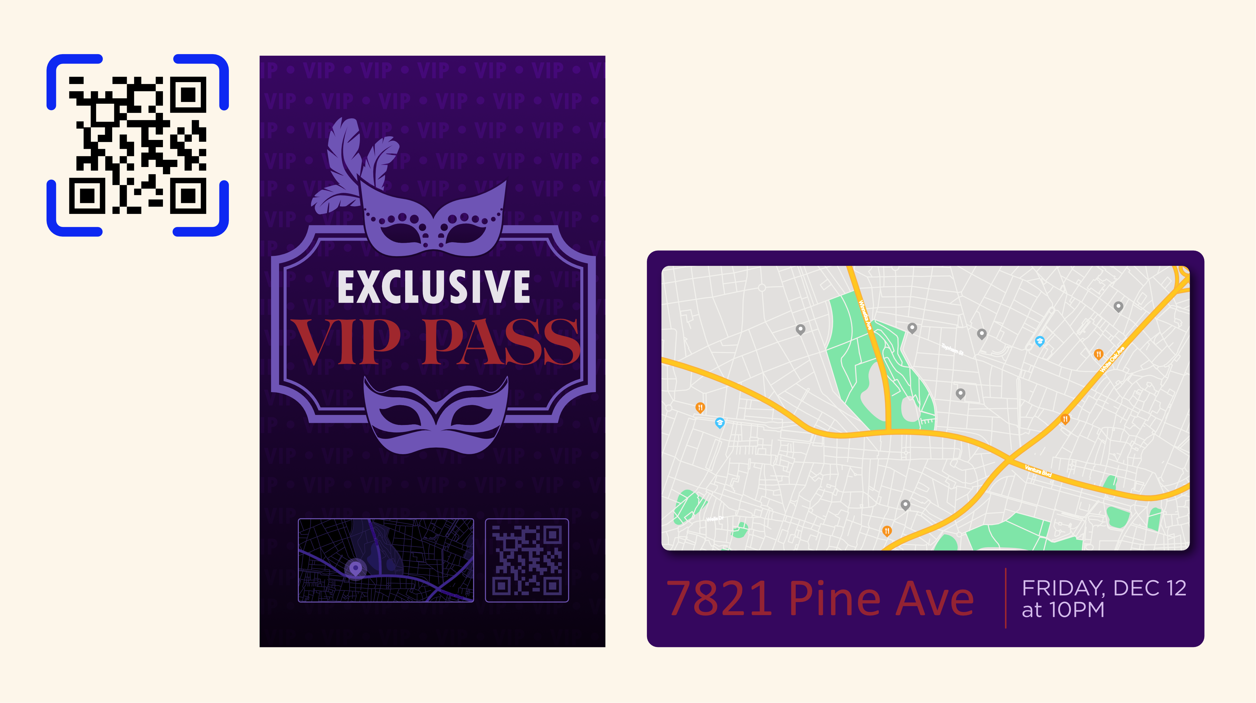
Branded Invitation Assets
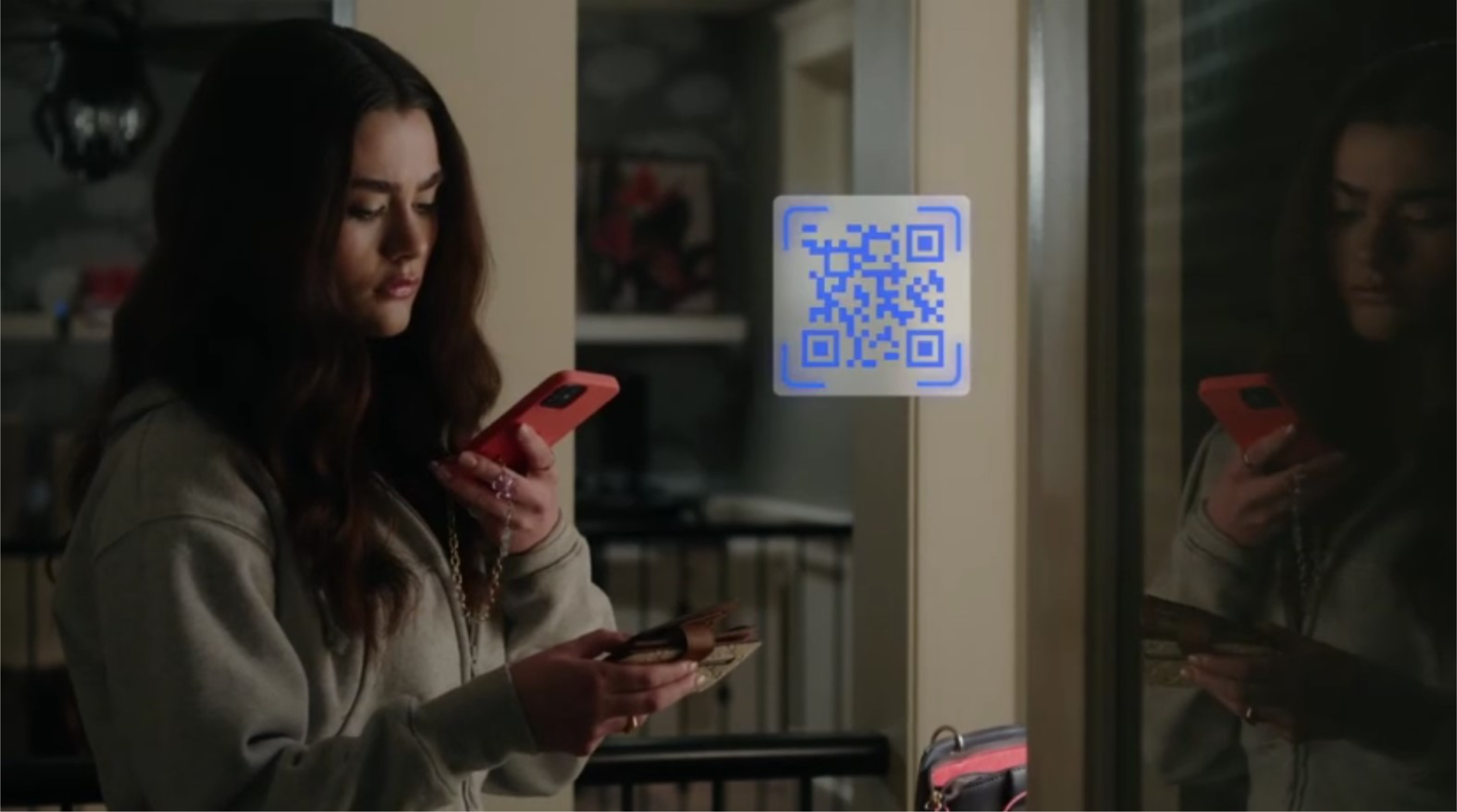
When app graphics need to stand out and help build the story (and the suspense) my approach is to exaggerate type, boost contrast, and dramatically simplify. That way, the audience can intuitively follow the experience without having to hit pause.


Start with a discovery call.